A stock chart is just a picture of price over time. Learn its parts and you can read any market.
The two axes
The horizontal axis is time; the vertical axis is price. Each point shows what buyers and sellers agreed on at that moment.
Candlesticks vs line charts
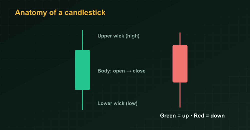
A line chart connects closing prices — simple but limited. Candlesticks show open, high, low and close, revealing far more about each period.
Timeframes
The same stock looks different on a 1-minute vs a daily chart. Intraday traders watch minutes; investors watch days and weeks. Zoom out for context, zoom in for entries.
Trend, support and resistance
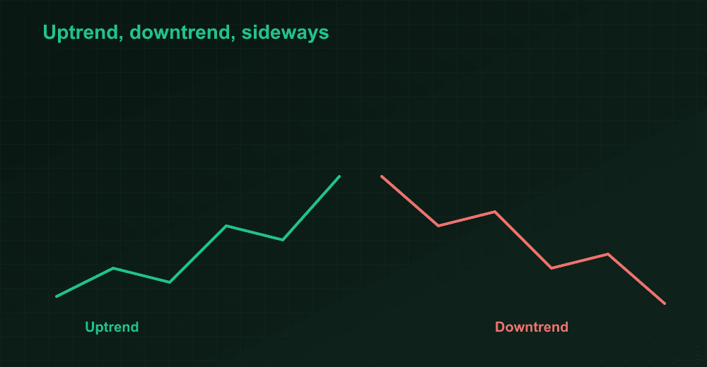
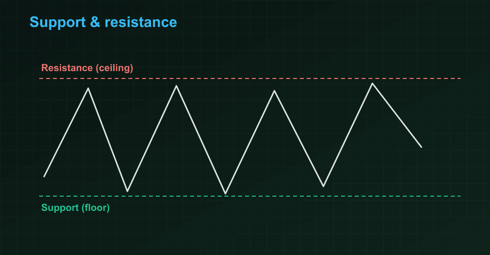
Is price making higher highs (uptrend) or lower lows (downtrend)? Mark the levels where it repeatedly reverses.
Volume
Volume shows how many shares traded. A breakout on high volume is more convincing than one on thin volume.
Key takeaways
- Charts plot price (vertical) over time (horizontal).
- Candlesticks show more than line charts.
- Match the timeframe to your trading style.
- Read trend, then levels, then volume.
Practise this free on StockYatra
Open a free account, get 10,000 virtual coins and trade live-simulated NEPSE & Indian markets with zero real-money risk.