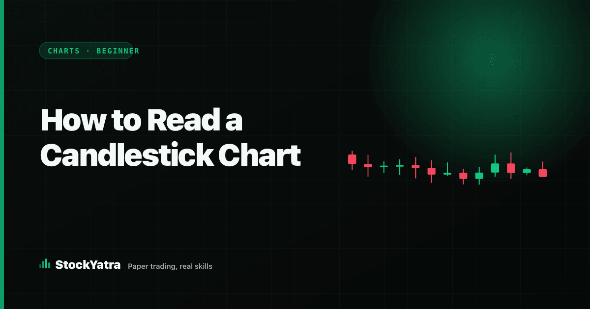
A candlestick chart looks busy the first time you open one: green and red bars, thin lines poking out of them, numbers along both edges. But every candle is answering the same four simple questions, and once you can read one candle you can read a whole chart. This guide takes you from a single candle to reading groups of candles, then shows you how to practise on a live chart for free.
In short
- Each candle shows four prices for one period: open, high, low and close (OHLC).
- The body shows open-to-close; the wicks show how far price travelled and got pushed back.
- Always choose the timeframe first: the same day looks very different on 15-minute and daily candles.
- Read candles in groups and with volume. One candle on its own proves very little.
- Practise with bar replay on the free StockYatra charts before any real money is involved.
Step 1: Read one candle (open, high, low, close)
A candle covers one period of time: one minute, fifteen minutes, an hour or a day. During that period price did four things worth remembering. It opened somewhere, reached a high, touched a low, and closed somewhere. Those four numbers are called OHLC, and a candle is simply a picture of them.
Imagine a stock that opens a day at Rs 500, climbs to Rs 520, dips to Rs 495 and closes at Rs 515. The body of the candle runs from 500 (open) to 515 (close). A thin line, the upper wick (or shadow), runs up to 520. Another thin line, the lower wick, runs down to 495. Because the close is above the open, the candle is drawn green. If the stock had opened at 515 and closed at 500, the candle would have the same shape but be drawn red, with the open at the top of the body.
Step 2: Read the body to see who won the session
The body is the distance between open and close, so it shows how decisively buyers or sellers won that period. A long green body means buyers pushed price up and kept it there until the close. A long red body means sellers were in control. A tiny body, where open and close are almost the same, means neither side won: the period ended roughly where it began, even if price moved a lot in between. A candle like that is called a doji, and it usually signals hesitation.
Step 3: Read the wicks to see where price was rejected
Wicks are the most underrated part of a candle. A long upper wick says price went up but could not stay there: sellers pushed it back down before the close. A long lower wick says the opposite: price fell, buyers stepped in, and it recovered. When you see several long upper wicks near the same price, that area is acting as a ceiling. Several long lower wicks near the same price mark a floor. Those floors and ceilings are the start of support and resistance.
Step 4: Choose the timeframe before you read anything
The same price action tells different stories at different timeframes. One trading day might be a single calm green candle on the daily chart, but on a 15-minute chart it could be a sharp drop in the morning followed by a slow recovery. Neither view is wrong; they answer different questions. A daily chart helps you see the bigger trend. Shorter timeframes show the detail inside each day, along with a lot more noise.
On the StockYatra charts page you can switch between 1-minute, 5-minute, 15-minute, 1-hour and daily candles from the toolbar. A good habit for beginners: look at the daily chart first to see where you are in the bigger picture, then zoom into a shorter timeframe for detail.
Step 5: Read candles in groups, not one at a time
One candle is one data point. The useful information comes from sequences:
- Uptrend: each swing high is higher than the last, and each pullback stops above the previous one. Green bodies tend to be longer than red ones.
- Downtrend: lower highs and lower lows, with long red bodies and weak green bounces.
- Range: price keeps turning around between roughly the same high and low, with mixed colours and many small bodies.
A few two- and three-candle shapes have well-known names. A hammer has a small body and a long lower wick after a fall. An engulfing pattern is a candle whose body completely covers the previous candle's body in the opposite colour. These are worth knowing, and our older guide to candlestick patterns covers them. But a pattern is only a hint. It means much more at a level where price has turned before, and much less in the middle of nowhere.
Step 6: Use volume as a second witness
Most charts show volume as bars along the bottom: how many shares changed hands during each candle. Volume helps you judge how serious a move was. A big green candle on high volume suggests many participants agreed with the move. The same candle on very low volume is less convincing. You do not need complex volume tools as a beginner; just notice whether big candles come with big volume bars.
Common mistakes beginners make
- Treating one candle as a signal. A single hammer or doji, without context, is close to a coin toss.
- Ignoring the timeframe. A "big drop" on a 1-minute chart might be invisible on the daily chart.
- Reading the chart you want to see. If you already own a stock, you will find bullish signs everywhere. Write down what you see before you decide anything.
- Forgetting the wicks. Closing prices alone hide where the market rejected price, which is often the most useful clue.
Step 7: Practise on a real chart
Reading about candles only goes so far. Open the free charts page, pick any stock and do this: switch to the daily timeframe, find the last three long-wicked candles and ask what happened next. Then press Replay, which hides the newer candles, and step forward one candle at a time, guessing each close before you reveal it. Our step-by-step guide to practising with bar replay walks you through a full session. If a word confuses you, the glossary has a short definition.
Key takeaways
- A candle is four prices: open, high, low, close. Body = open to close; wicks = the extremes.
- Long bodies show conviction; small bodies and dojis show hesitation; long wicks show rejection.
- Pick the timeframe first, then read sequences of candles with volume.
- Patterns only matter in context, at levels where price has reacted before.
Education only, not investment advice. StockYatra is a learning app: prices on its practice market are simulated around each stock's real-world price level, coins are virtual, and nothing in this article is a recommendation to buy or sell any security. Every example uses made-up round numbers to explain an idea, not to describe a real stock.
Summary in Nepali (नेपालीमा सारांश)
क्यान्डलस्टिक चार्टको हरेक क्यान्डलले एउटा समयावधिको चार मूल्य देखाउँछ: खुल्ने (open), उच्च (high), न्यून (low) र बन्द (close)। हरियो क्यान्डल भनेको मूल्य खुलेभन्दा माथि बन्द भयो, रातो भनेको तल बन्द भयो। बडीले खरिदकर्ता वा बिक्रेता कति बलिया थिए भन्ने देखाउँछ, र लामो विकले मूल्य कहाँबाट फर्काइयो भन्ने देखाउँछ। सधैं पहिले टाइमफ्रेम छान्नुहोस्, एउटा क्यान्डल होइन क्यान्डलहरूको समूह र भोल्युम हेर्नुहोस्। StockYatra को निःशुल्क चार्टमा बार रिप्ले प्रयोग गरेर वास्तविक पैसा जोखिममा नराखी अभ्यास गर्नुहोस्। यो लेख शिक्षाका लागि मात्र हो, लगानी सल्लाह होइन।
Practise on a real chart, free
Open the free StockYatra charts in your browser, no sign-up needed, or download StockYatra on iPhone or Android and start with 10,000 free virtual coins. Prices are simulated and coins are virtual, so no real money is ever at risk.
Chart reading for beginners: the full series
- Support and resistance, explained with examples
- RSI and MACD for beginners, and when they fail
- Moving averages: SMA vs EMA and crossovers
- Chart types: candles, Heikin Ashi, Renko and line break
- How to practise chart reading safely with bar replay
- Stock market glossary · Learn hub · What is paper trading?